


1. I initiated my research process by delving into the realm of coffee products and examining the impact of online ordering services. The objective was to ascertain the feasibility of users purchasing coffee products online while aligning with their specific requirements, including allergen specifications, personalized customization, and access to comprehensive product information.
2. I performed a competitive analysis of applications offering online coffee ordering platforms. This comprehensive examination provided insights into user interactions with these products, unveiling opportunities for features that could be incorporated into my own application.
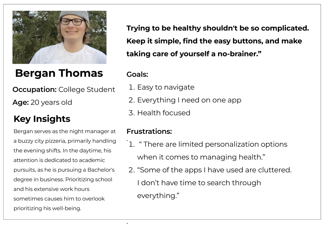
3. I conducted interviews and created empathy maps to acquire an understanding of my target users and their requirements. As a result of my research, I identified a primary user demographic comprising adults seeking quick and seamless access to high-quality products.
Pain Point #1: "When ruins this app, I want to be able to make my own profile, so I can save my favorite items."
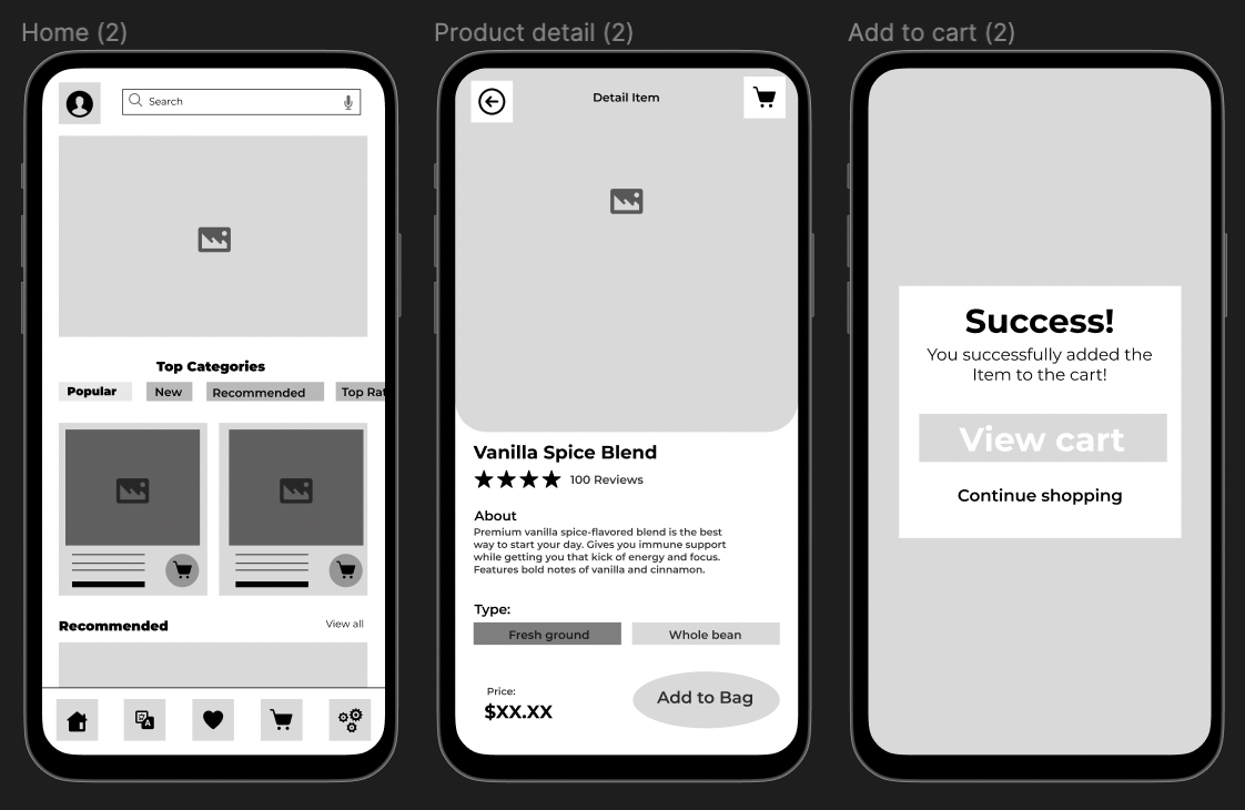
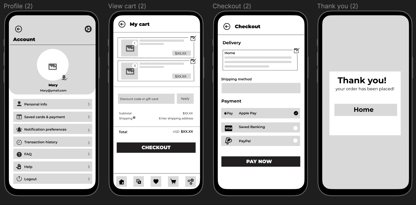
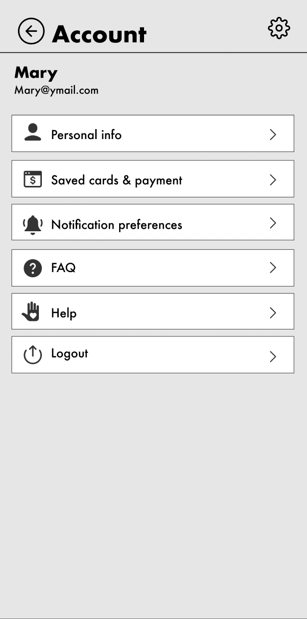
Feature requirement: Profile settings & Favorites tab
Pain Point #2: "When using this app, I want to see nutrition information about each products, I want to know what I am purchasing."
Feature requirement: Nutrition info and credible information.
Pain Point #3: "When I use the app i’m not sure what I might need, I want to take a quiz on possible vitamins and supplements."
Feature requirement: Quiz, blog and article links.
Pain Point #5: "I want to see what others think before I buy something."
Feature requirement: Popular section and accessible ratings/ reviews
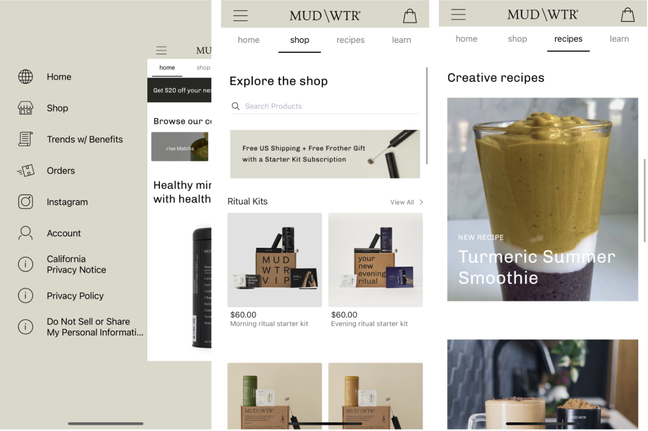
Strengths: Modern and clean. Additional free services such as recipes and blog in app. User focused products. Easy in app purchase options and package tracking options. Easy access to reviews and ratings.
Weaknesses: There are no accessibility options. The font size is small in the app, especially the product review section, and lacks options for larger text.
Strengths:
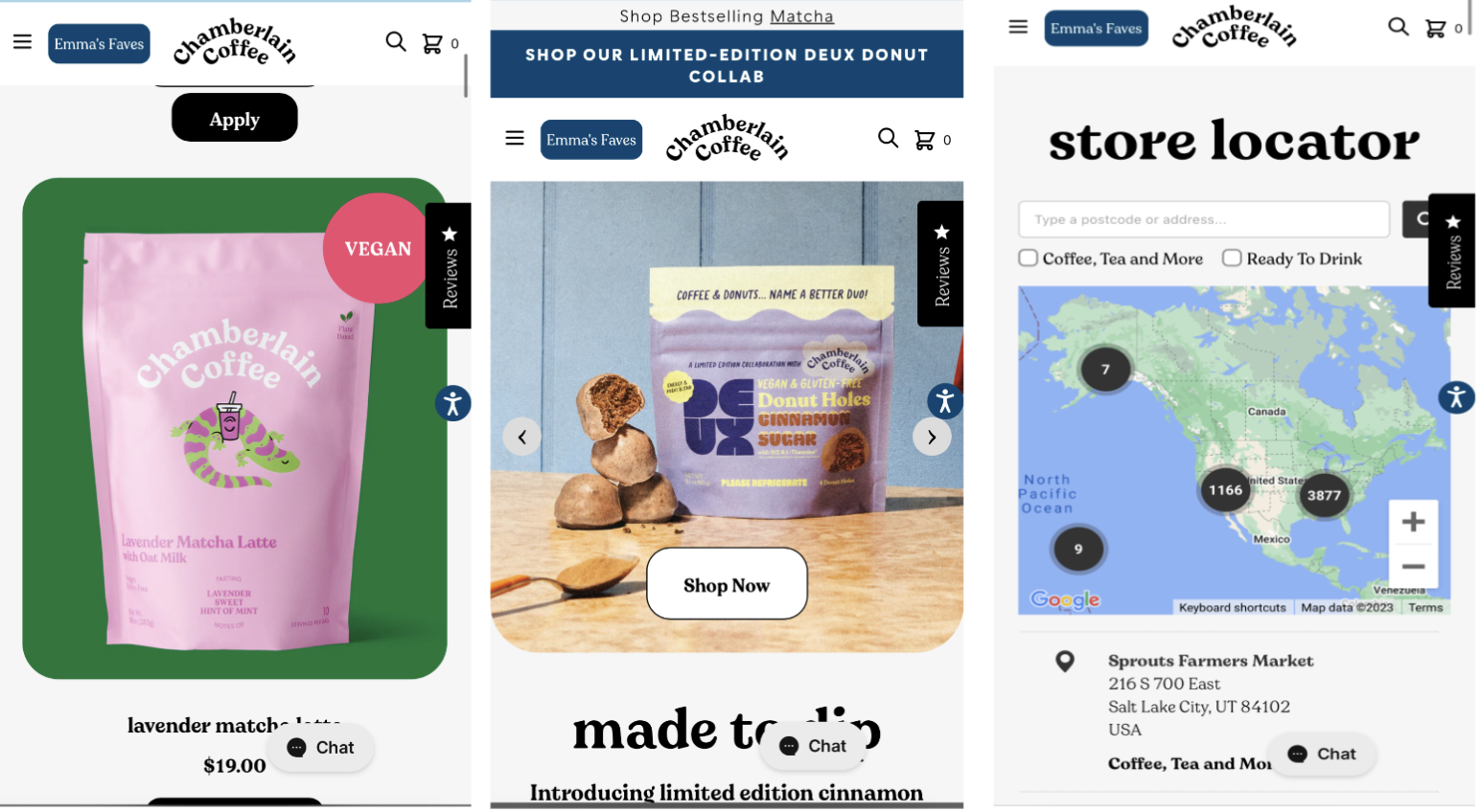
Pays attention to details and visual design: approachable, modern and fun. Offers easy purchase options and nutrition information. Leads with brand identity and has a strong presence on social media.
Weaknesses:
Only have a website, Chamberlain Coffee does not have an app designed for iOS or Android. Can appear cluttered on mobile screen. Email sign up appears on every screen. Navigation features provide the same results.
- Create a brand identity and marketing strategy to reach a different crowd and increase SEO on Google Search.
- Be descriptive on the health benefits and nutritional facts of each product
- Include different types of accessibility, including text to audio, change text size options, language options.
- Clear layout and high contrast.

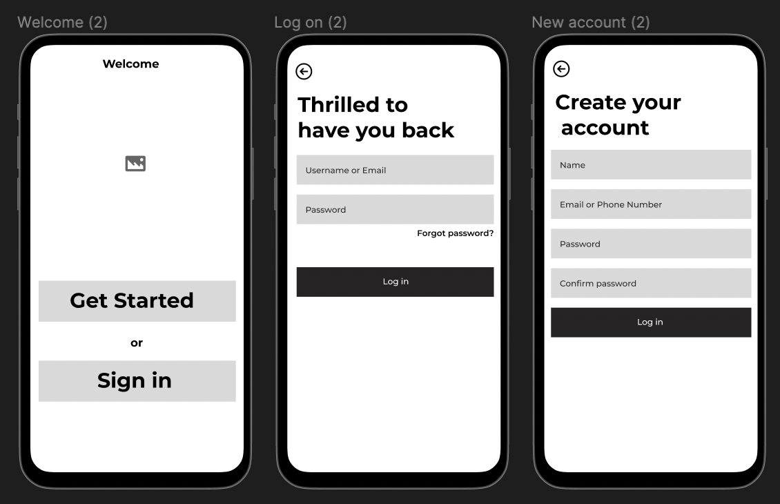
Using the completed set of digital wireframes, I was able to create a low fidelity prototype. The primary user flow I connected was searching for a coffee product and placing the order for purchase, so the prototype could be used in a usability study.
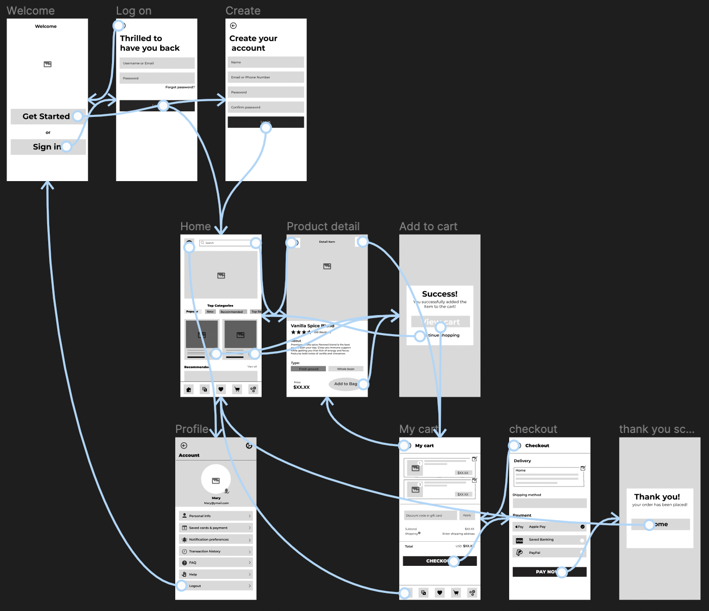
Using my prototypes, I enlisted five participants for a remote moderated usability test on my designs. The test took about 5 to 15 minutes. During the testing session, users were asked to complete a series of tasks to gain insights into their thought processes. Focusing on Key performance indicators (KPI) including: time on task, user error rates, conversion rates and drop off rates. Participants were also encouraged to share their thoughts and provide feedback on the prototype.
Methodology- moderated usability study
Location- USA, Remote
Participants- 5 Participants
Length- 15 minutes
1.Time on task
2. User error rates
3. Conversion rates
4. Drop off rates
Following user interviews, I consolidated and categorized my observations into distinct issues, assigning a task completion ranking to each prompt. This process enabled me to prioritize and grasp the significant pain points, providing valuable insights for crafting innovative solutions in my redesign.
1. Some users had hesitations when using the drop-down menu options located in the search bar. The few that had issues seemed overwhelmed.
2. Majority of users had issues finding the nutrition information. They assumed it would be more “front and center”.
3. A few users had issues finding the view cart function.
1. Include a smart-suggestion in the search bar as users type. Include a search history option feature.
2. Include nutrition information below product title so users do not have to click for the information.
3. Make the cart icon locked on the top right of the screen, so it moves with the user as they view the product. This way they do not have to scroll back to the top.


The Impact:The Coffee Co. app makes it easy for users to order high-end coffee items, including nutritious choices tailored to personal preferences. It's the perfect solution for those pressed for time yet craving a delightful morning ritu
What I Learned: While designing the app I realized the importance of prioritizing the user in every aspect of the design. I learned that everyone is unique and diverse user testing is the best way to fully understand a the products usability. Moreover, I discovered that initial design concepts are just the start and that iterative designing (usability studies and feedback) is a critical step for continuous improvement and a better/ more accessible app.
Next Steps:Following this certificate there are additional steps to perfecting this app. Including, conducting another round of usability study that encompasses a wider range of participants. This will further validate the current solutions effectiveness and address the users' pain points. Second being to conduct more user research to determine new areas of need. Third, to create more user personas and researching additional secondary data.
Contact me!
Email: taylormweis@gmail.com
Linkedin: www.linkedin.com/in/weis320